[OSSCA 2024] Applying & Githru VSCode Extension Review
My experience applying to the Open Source Contribution Academy and exploring the Githru VSCode Extension before contributing.
My experience applying to the Open Source Contribution Academy and exploring the Githru VSCode Extension before contributing.
The password you enter is used to open, edit, and delete secret comments.
링크 정보를 불러오는 중...
I created a Twitter account mainly to follow developers and stay closer to the tech community. While browsing my feed, I discovered that the Open Source Contribution Academy (OSCCA) was recruiting experiential mentees.
I started looking for a meaningful team project that I could pursue alongside my final semester. Contributing to open source, especially with guidance from a mentor, felt like a valuable opportunity. After reviewing multiple projects in the program, I chose two projects that used TypeScript and involved front‑end development as my first and second choices.
링크 정보를 불러오는 중...
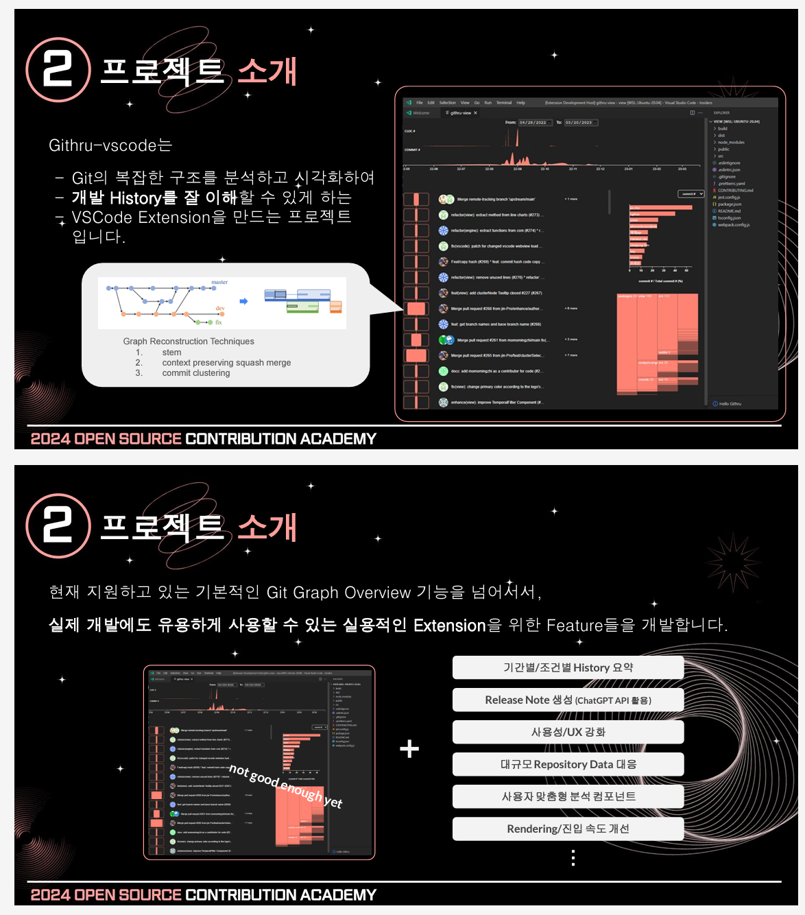
This open‑source project is a VSCode extension that visually analyzes Git metadata.
I had previously used Git GUI tools such as SourceTree or Git Graph. However, I often ran into errors and eventually ended up using Git Bash again. Even so, the visual advantages of GUI tools were always something I missed.
Githru attempts to fill that gap by providing visual insights into commit structures and contribution patterns while still working alongside Git Bash or the built‑in VSCode Git features.
Because the application process included a small pre‑task, I actually installed and ran the extension beforehand. The README suggested running npm build:all in the Getting Started section, but no matter how many times I tried, the command did not work.
Instead, I installed the extension directly in VSCode, ran it in debug mode, entered a Git token, and was able to access it through the bottom panel just like other extensions.
The pre‑task asked applicants to describe something that felt lacking or could be improved, so I tried to analyze the tool from several angles while using it.
On the right side of the interface, the extension visually displays the file structure and contributor percentages.
The animation when navigating the file structure is smooth and the UI is generally clean. However, the "go back" interaction felt slightly unclear.
For example, when navigating deeper into the file tree and returning to the parent directory, it would be easier to understand the navigation flow if the parent node appeared on the left side as a visible reference.
Similarly, when switching from viewing commits of a specific contributor back to the overall contributor view, a clearer back interaction would make the navigation feel more natural.
Another small issue was the large graph shown at the top of the interface. It represents code counts over time, but at first glance it felt somewhat abstract. Displaying exact values on hover would likely make the information easier to understand.
Allowing users to choose a custom point color using RGB values is an interesting idea.
However, the way the color is applied feels slightly ambiguous. When selecting a color, it is applied immediately to the current branch being viewed, while other branches still retain their previous colors. Only after restarting or reconnecting to Githru does the selected color appear across all branches.
From an interaction perspective, this behavior feels inconsistent. If a user changes the color, it would be clearer if the system either:
Clarifying this rule would likely improve the UX.
Another thing I noticed was that most interface colors look very similar in tone. Because graphs, folder structures, and other visual elements share almost the same color intensity, the visual hierarchy is not very strong.
If the interface introduced a color system with several brightness or tone variations (for example four or five related shades), the readability of graphs and structural information could improve significantly.
However, since the system allows users to freely pick RGB values, automatically generating such color variations might be difficult. Two possible alternatives came to mind:
This approach could preserve user customization while keeping the interface visually consistent and easier to read.
Finally, I also felt that the documentation could be improved.
When entering the GitHub repository for the first time, the README emphasized contributor information quite prominently, while explanations about the project itself were relatively limited.
Other open‑source projects, such as ArgoCD, provided more detailed documentation about installation steps and project structure, which made it much easier for newcomers to understand the project quickly.
Improving the documentation could make this project more approachable for first‑time users and contributors.
Overall, the project felt clean and focused, including only the necessary features without unnecessary complexity.
I also became curious about how the visualization would behave when analyzing much larger repositories.
After exploring the tool this way, I felt that there were several areas where I could potentially contribute, which ultimately led me to apply to this project.
A record of building the foundation: from ideation and prototyping to navigating senior feedback and implementing the MVP
An in-depth look at why we normalize vectors, connecting game movement logic with Blender's "Apply Scale."
A reflection on a 6-week team sprint: covering architectural challenges, the nuances of collaboration, and technical growth through senior feedback.
A reflection on the 10-week Boostcamp membership sprint: technical learning, design challenges, burnout, and lessons about using AI effectively.
A personal retrospective on the Boostcamp Web·Mobile Challenge phase: daily missions, CS learning, peer feedback, teamwork, and how I learned to grow alongside AI
A record of exploring the pros and cons of functional programming and object-oriented programming, and the reasons for choosing functional programming in React
My experience preparing for Naver Boostcamp Web·Mobile 10, completing the Basic course, and taking the problem-solving test.
A summary of my contributions to the Githru project during the OSCCA master phase, including UI improvements, issues, and Pull Requests.
My experience during the OSCCA challenge phase, including raising issues and making first Pull Request while exploring the Githru project.
My experience applying to the Open Source Contribution Academy and exploring the Githru VSCode Extension before contributing.
마지막 아티클까지 모두 확인했습니다.
My experience during the OSCCA challenge phase, including raising issues and making first Pull Request while exploring the Githru project.

A summary of my contributions to the Githru project during the OSCCA master phase, including UI improvements, issues, and Pull Requests.
A reflection on a 6-week team sprint: covering architectural challenges, the nuances of collaboration, and technical growth through senior feedback.